MMT Part 5. Stage 7 Reflection

Stage 7 Reflection
Maintain your record of how you went about making these final pieces and record and reflect on the final outcome. Draw, photograph and discuss the work in your learning log / blog, reflecting both on this part and on the course as a whole. Make sure that this reflective commentary is clearly labelled so that your tutor can find it easily when you submit your work for tutor feedback.
IMG_5067.JPG
Sample 6 (side one of final piece)
IMG_5069.JPG
sketch of sample 6 highlighting depth and colour
media – wax & oil pastels, Payne’s grey, chrome orange & aliz crimson w/colours, tea, coloured charcoal pencils and fineliners, green embroidery silk
The sample provided me with lots to observe and think about and I have responded to what first resonated with me at the time of drawing.
Observing pops of colours, shadow, line and tension. I really enjoyed making this.
IMG_4912.JPG
Sample 7 showing the surface structure

MMT Part 1 Stage 1 Surface Distortion Research Folder

             Surface distortion research folder
 
Search for and record in your learning log information about some artists and designers who distort a material’s surface as a form of creativity. Aim to research between 5 to 8 practitioners.
Collate the imagery in your learning log along with a brief written discussion of what you think of the work, how it may be relevant to this part of the course and, most importantly, how it might influence or inform your own practise
 
Anne Kyyro Quinn
IMG_2662.JPG
annekyyroquinn.com
Anne Kyyro Quinn This Finnish born artist and designer set up her studio in 1999. Her work includes wall-panels, upholstered chairs, headboards, soft furnishings and art projects but to me her most exciting projects involved large public spaces such as cinemas, atriums and conference areas where large surface areas can be utilised to make a dramatic impact.
Anne uses 100% wool in different colours to create felt which she manipulates by folding, creasing, coiling and layering into repeated organic textured shapes to surface cover walls and panels. These coloured surfaces change the mood, sound and temperature within the space as the felt would absorb sound, and the fabric would also insulate an enclosed space. The light falling on these textures surfaces, if natural or changing would create shadows that would give the appearance of the surface areas moving. I can imagine these designs being very curious to the senses and impactful.
how it may be relevant to this part of the course ?
This designers work is all about textured surfacing mainly on a flat plane which she creates through manipulation techniques. This is one method of producing distorted surface and is very relevant to this course because of that.
 most importantly, how it might influence or inform your own practise ?
I could distort fabric to experiment with creating something similar in the manipulation exercises, working with repeat patterning for example.
IMG_2663.JPG
Giles Miller
  1. Walnut and high gloss gold ceramic tile installation for Sukthai Restaurant Leeds by Giles Miller Studio
IMG_2664.JPG
IMG_2665.JPG
“Prospectives” Pavilion
  Images taken from Pinterest and  “Prospectives Pavilion” photos linked to
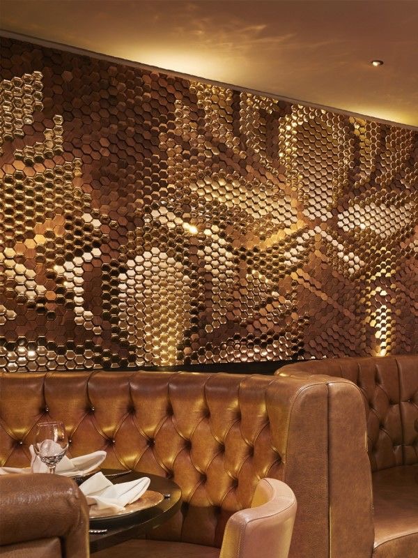
Giles Miller’s studio produces dramatic wall panels, structures and monuments for public spaces inside and out amongst nature. Much of the work is created in a 3D skeletal format working in frame like structures that makes use of space which reflects and responds to light.
An extensive use of different materials are used to respond to the various projects, these designs and surface areas have been created to work sympathetically with the environment, for example inside with subdued lighting using warm metallic reflective colours, see top photograph, or outside with a large organic form using natural materials.
With the “Prospectives Pavilion” (see bottom three photos) the scales were made from cedar wood that can be adjusted to let in light and air, which would change the shape of the structure but also the surface area would differ in appearance with the changing natural light.
Each scale has been inscribed with a poem or message taken from local schools, the  community and contributers to the project and people’s initials scribed on the trees from the surrounding woods.
Looking at the interior of this structure really suggests to me a space that would encourage
sharing ideas, self expression and learning, it also has an ancient feel to it. A pagan place that should be wherever there is human habitation, a place where things get sorted !
how it may be relevant to this part of the course ?
The surface textures of this designers architectural work often has a repeat which could be relevant to the theme of distortion because repeats are also a way of working with paper and other materials to produce interesting surfaces.
most importantly, how it might influence or inform your own practise ?
I will look for similar materials that have depth and texture to manipulate and I am sure will produce some interesting sketches. Also, knowing that Giles Miller likes to work in frame like structuring gets me thinking about holes, apertures and rupturing surface materials, and folding back to reveal another surface or area.
IMG_2666.JPG
Grace Tan
Refuge by Grace Tan
Photo linked to lostateminor.com
Grace Tan is a Singapore born artist that set up the company www.kwodrent.com  in 2003.
She works with textiles in unusual ways. By looking at her work it’s clear she is driven by creating work in 3D. This cloudscape pictured above was made from polypropylene loop pins.
I am not sure how I feel about this exhibit, but maybe lying underneath it I would get a different perspective literally, it could be very impressive but I find the synthetic take on a cloud formation rather obvious. Looking at this would make me just go outside and look at the real thing. It also reminds me of cauliflower florets. Maybe if it was dull and grey outside and had been like that for weeks it would be a refreshing and joyful thing to go in and look at?
However what I find interesting is the use of prolypropylene loop pins to create cloud formations  which is a clever and inspiring technique and that makes me think I should investigate the use of unusual materials to suggest something completely different from its original state.
how it may be relevant to this part of the course ?
Although I am not that enthused by this particular example of Grace’s work, I do think creating something like a cloud is very clever and most importantly developing shapes in three dimensions is a way of producing distorted surfaces, also her delicate folding of fabrics to create form from blocks of fabrics and cubic tartans are encouraging me to think differently about how your vision-sense can be enhanced by looking through a 3D textiles space.
most importantly, how it might influence or inform your own practise ?
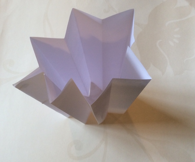
To date, I have not really worked with a 3D plane, this designer does all the time so I am encouraged to start to try out these practises. Origami is familiar to me and I would associate that craft with paper, but it will be interested to experiment with other materials.
IMG_2668.JPG
Jule Waibel
Images from metalmagazine.eu
Jule Waibel is a German designer who is fascinated with the way our universe expands and contracts and doesn’t see why anything else within it shouldn’t also do the same. Her fascination with folding started when she was undergoing an art project at The Royal Collage of Art where she was doing an MA in Design Products in 2013.
Jule works with many different materials including glass, leather, paper, textiles and pvc
and has produced many different products with this same theme of a pleated and folded surface texture, such as furniture, wallets, umbrellas, clothes and vases giving the impression that the object you are viewing can easily change its appearance and form, expand and retract.
Folded trousers – I think this is a very clever design, the folded creased material embraces the form and there is an air of something otherworldly and organic about them, the profile or line silhouette is interesting because it is unexpected. I like the undulating shape that runs down the trousers which gives them a flowing movement and the soft folds remind me of layers of petals or the gills of a mushroom.
The sculptural textured garment makes me curious to want to touch the fabric and crease it in my hands and I would like to see how they move when someone is walking or dancing in them.
IMG_2667.JPG
Jule Weibel
This object does interest me very much, it’s made from glass so is transparent and absorbs and reflects the light. Some areas of this vase could be seen through and various angled shapes would shine. It looks like you could hold it in your hands, manipulate and crush it, which is outside of our understanding of how that material works in the real world.
It’s angular almost brittle surface appearance reminds me of a boiled sweet wrapper. It’s a suggestion of pushing the boundaries of how things are.
how it may be relevant to this part of the course ?
The initial practical exercises for this assignment focus on folding so this designer fits the brief exactly. Her practise informs me that it is possible to fold a surface material and from that create almost any shape, a shape that may remind us of an object that does not usually expand or retract. This concept encourages us to push the boundaries of conventional design.
 most importantly, how it might influence or inform your own practise ?
Looking at form and attempting to describe a form differently will make me think more about construction and how shapes can be described dimensionally.
IMG_2669.JPG
Mathias Bengtsson
Growth table   Instagram.com
Mathias Bengtsson is a Swedish born industrial and furniture designer that describes himself as an artist. He creates organic, chaotic, flowing structures that has a sense of wild art nouveau. He likes to work with natural products, earth, sand, wood, metal and stone, products we have to hand, that maybe we should focus on this natural resource.
He believes we can borrow from nature and a piece of furniture needs to evoke an emotional response and inspire us rather than be practical. He claims that the design methods of creating furniture that works for us on a utilitarian level was solved back in the 1950’s and do not needs to be revisited.
He designs for himself and each piece is experimental.
The Growth table above in a way, is not like a table. I think its purpose is to be looked at and considered as a structural form, it just happens to be a practical utilitarianism piece of furniture that you can place objects on. I wonder what sense or meaning would objects take on once placed on this table. I can image a large vase of wild flowers spilling out over the table top or a streamline stainless steel coffee pot reminding us of the aesthetic beauty of the piece that the table is supporting, the table itself enhances the beauty of the objects that are placed upon it.
IMG_2670.JPG
Each project starts with a drawing or painting, from there he can get a real understanding of how the design is going to proceed. The photograph above shows some of his initial working tools, a paint box, sketchbook, and a small machete to name a few items on the table.
how it may be relevant to this part of the course ?
In some ways you would say Mathias does not actually distort the surface of a material, instead he distorts our traditional view of certain objects, using organic shapes and cellular structures to create a new approach to what is expected. I also immediately sense that by observing an object and through that understanding its structural form an informed and sophisticated design can be created, which can evoke curiosity and a feeling of well being. In that sense I would say that Mathias is not a product designer but an artist and this is how he describes himself.
most importantly, how it might influence or inform your own practise ?
I am reminded by the importance of preparatory work, drawings, paintings and models that Mathias prepares before he moves forward with his projects, how relevant and important this process is. Also, it is clear that he is an observer of nature, that he thinks about how things are formed in nature by his cellular and vine like designs. I need to observe in greater detail the objects that inspire me and incorporate that into my work.
IMG_2672.JPG
Louise Nevelson
IMG_2673.JPG
1976 wood painted black 96”x 48”x 30.25”
Born in Russia 1899 died in New York 1988
Louise Nevelson was an American Sculptor that worked mainly with wood. Found objects would be assembled and then painted a unifying flat colour, usually black, white or gold. As well as wood she also experimented with other mediums such as bronze, terracotta and plexiglass.
Looking at this image above on a 2D format is in a way quite frustrating, I would like to look at the different angles of the shapes and spaces in between in situ. The matt monochrome colour allows me to focus purely on the shapes and texture of this work. The various tones of colour informs me where various shapes sit on the plane. If more than one colour was introduced it would not work, the colours would be too distracting and interfere and separate the shapes. This unification gives the work order and relevance. Many becoming one.
I can clearly see the different elements that have been applied to the piece, and now they take on a different meaning, now the shapes represent new components.The work has movement, To my eyes the chairs are rotating within a frame like a water mill and I can almost imagine the whole thing coming to life making squeaking and grinding noises as it rotates. This sculpture reminds me of machinery from the Industrial Age and I am sure the  “steampunk” movement must to have been influenced by Louise Nevelson’s work.
how it may be relevant to this part of the course ?
Louise creates beautiful and intricate sculptures from everyday discarded found objects.
Her re-use of the ordinary to re-invent and push the boundaries of one form so it becomes another encourages the student to imagine new ways of combining forms and be inventive and I think this will become relevant to this part of the course.
Although Louise Nevelson does not distort the original surface material by a method of connecting the wooden objects she creates a distorted surface.
importantly, how it might influence or inform your own practise ?
Her work suggests to me that I should be look closely at a found object, to  use my imagination and formulate new ideas in orderto create something different from the original of creative worth.

MMT Part 1. Project 1. Exercise 1 Folding and crumpling

Part 1. Surface distortion
Linear Accordian pleats
 
Create your own linear Accordian pleats. Repeat the linear Accordian pleats in a range of papers and materials – even those that appear to be unlikely to be successful and record the processes in your learning log/ blog
IMG_2676.JPG
Figure 1.1 Accordian pleat with A4 photocopier paper
 
The paper felt smooth and the creased edges felt crisp and pleasant to touch.
This initial exercise was very elementary, as a child it’s something l did in crafting projects so there were not any real surprises.
Visually I expected the darker tones to be where the folds were in shadow. However, any subtle movement shifts the shadows on the pages and I like the shadows the paper castes on the table.
IMG_2685.JPG
Figure 1.1a  Accordian pleat with striped wallpaper
IMG_2686.JPG
Sketch of figure 1.1a pleat with striped wallpaper
This wallpaper had  a slightly more robust thickness than the photocopier paper and it was a bit softer so it was easier to fold. The design is a candy stripe of alternating colours of gold and cream. I folded the paper in the same direction as the striped paper but folded every alternate centre stripe. I wanted to see how confusing visually that would be.
I am a bit disappointed as I thought it would be more dramatic. It’s now more confusing to work out the folds, but I can see an irregularity in the stripes so the pattern is starting to interplay with the folded paper.
But rotating the paper gave me a very different viewpoint. The stripes became wider at a certain angle and became regular, that was an interesting outcome.
This was so difficult to draw, looking at all the creased lines, trying describe the correct angles and then placing the gold stripes within that. An almost impossible task, but I have had a go.
I cringe at the results. This is a reminder of how challenging drawing can be and you really need to look ! The drawing does make sense but it’s so badly drawn, it doesn’t come through.
IMG_2687.JPG
Figure 1.2  Accordian pleat from a laser cut Christmas Cracker
This sample was pleasing to touch as it has a very fine sparkly metallic coating so slightly rough, rather like a fine sandpaper. I enjoyed the process of folding the creases, lining them up with the negative shapes of the laser cut design of the diamonds in the centre.
I thought the outcome would be interesting because of the metallic surface, what is really interesting is the line silhouette of the rounded and serrated edges, they seem to soften the creased lines, also the diamond negative shapes in the centre break the folded lines visually and create an interesting structure. I imagined a building this shape as I looked at it.
With the both cylinder Accordian pleat shown below and this Sparkly pleat I have come to the conclusion that if you introduce a curved shape it seems to soften the overall look of a geometric sample.
IMG_2684.JPG
Figure 1.3 Narrow Accordian pleats with A4 photocopier paper
This narrow pleated sample is a lot more flexible to the touch than the previous Accordian pleat. The structure is easier to manipulate
It was more difficult to get the paper folded to start with than I anticipated. I didn’t know what to expect from the outcome but it’s interesting to note that the overall look and texture is quite different than the previous sample.
Rotating the sample suddenly creates a switch of shadow from one plane to the next. The white surface is a great medium for the light to play on.
IMG_2678.JPG
Figure 1.4 Accordian pleats cylinder with A4 photocopier paper
This sample was surprisingly tricky to try to manipulate into a cylinder shape. The edge that was joined with white tac was not at the same spaced angle as the other folds.
I doubled up on the pleated photocopier paper to achieve an circular pleated shape. It’s not perfect because I needed to attach one side with white tac. I was intrigued by the different shapes I saw as I was moving around the object to get a good photo. I felt by making a cylinder shape that a softening of the overall shape occurs, less geometric and more organic like a flower.
Any subtle movement creates different angles, shapes and shadows and looking into the centre of the 3D shape achieves even darker tones.
IMG_2679.JPG
Figure 1.5 Accordian pleats using shaped paper
IMG_2682.JPG
sketch of Accordian pleats using shaped paper
I was immediately struck by the flat subtle tones on the paper and thought the best way to interpret that was with watercolour paint. It’s a bit clumsy but I am glad I was brave and interpreted it in this way.
When creating the outside line silhouette of the accordian paper I purposely cut the line in a rough random manner and what I noticed was the line between the regular folds and line silhouette were very different. The straight folded edge made me focus on every different nuance on the random edged line.
The seemingly simple shapes and areas of varied tones were surprisingly difficult to capture accurately, hopefully my results will improve as I work through the course. Capturing the exact tonal qualities is a not as easy as it looks.
IMG_2689.JPG
Figure 1.5a  Accordian pleat using tea stained texture kitchen roll
The sample has a complex organic irregular surface design with many different tonal and textured qualities. It’s the softest of all the papers chosen so far and very easy to manipulate. It’s impossible to define a sharp crease. On close inspection the creased line is also serrated because of the texturing of the paper.
I expected the sample to be a lot more organic than the previous samples, which it is. The folds themselves seem to curl away from each other at the edges which gives this sample more movement.
The strong surface pattern takes dominance over the changing angles as you rotate the sample.
IMG_2692.JPG
Figure 1.5b Accordian pleat using paper backed gingham linen mix
IMG_2693.JPG
Sketch of figure 1.5b Accordian pleat using paper backed gingham linen mix
This small sample approx size A6 appears to have a spring to it. If you fold the sample shut, it springs back. I could feel the surface texture of the linen when I folded it. The gingham check now seems to create a dominating stripe running through it so the folds have changed the characteristics of the original pattern. Looking at it from a certain angle the stripe also looks wavy giving the design more movement.
I knew the sample would be easy to fold as the paper backing gives the fabric more resilience. I like the different appearance the folding has created towards the design.
Once more the design seems to dominate the structural aspect of the sample.
Again, I really struggled drawing this sample, trying to work out the mountain and valley folds opposed to the gingham design was playing visual tricks. A difficult and slightly frustrating exercise.

MMT Part 1. Project 1. Exercise 2. Folding and crumpling

Part 1. Surface distortion

Exercise 2 Rotational accordion pleats
Create a series of rotational accordion pleats. Experiment with the size of the pleats and the regularity of the spacing. Explore the possibilities of other shapes and materials using this technique and record your results
 
IMG_2702.JPG
Figure 1.7 rotational pleat with A4 photocopier paper
This photograph of the above sample describes curves as well as lines, the light has softened some of the lines of the sample. The outer shape of the sample has taken on a look like a stags head or a mask, it has a pagan, mysterious quality to it and the way I have photographed it with the dramatic black shadows on the underside gives the sample an Art Deco look, it could almost be a wall light ?
I had two attempts at this folding before I got it right, it was tricky to line up the crease down to the centre fold from the left and right hand corners. Initially the paper resisted but it became easier the more folds I made.
As I rotated the sample I realised the folds have generated a rather complex design, it also has different heights and the shape suggests to me speed or flight.
IMG_2705.JPG
Figure 1.7a rotational pleat with machine embroidered linen
IMG_2709.JPG
Drawing of figure 1.7a rotational pleat with machine embroidered linen
This sample was made from a linen machine embroidered fabric. It was extremely difficult to fold by hand so in the end I ironed in the folds. Some of the angles were easier to crease because the fabric stretched on the bias. Compared to the paper sample above this has taken on a much softer look, the material may help to suggest a basque or stays on an 18th Century gown.
I am not a dressmaker but looking at this gets me thinking that fashion designers even 200 years ago must of experimented with relatively complex folding techniques to form ideas.
I didn’t know what outcome to expect but I knew this fabric wasn’t going to be easy to fold and I nearly gave up on it, however I really wanted to see the end result so kept with it.
As I rotated the sample my attention kept shifting from the pattern on the fabric to the shadows and finally the overall shape .
It’s interesting to see the vine and leaf design disappear behind one fold and a section of it reappear displaced on the other side. Once more I found this drawing a confusing and challenging task, but I know that this is a useful process towards understanding folding materials.
IMG_2712.JPG
Chart on napkin folding on the walls in Mottisfont Manor
Today I went to a National Trust property to look at a Heath Robinson exhibition and whilst walking around the stately home I saw this chart on the wall in one of the rooms. Presumably one of the many tasks performed by the staff in the past for setting the table.
IMG_2707.JPG
Figure 1.7b Accordian pleat with A5 recycled paper 
The sturdy paper was easy to fold and I managed to fold it really fast as I had made this a few times by now. I am a bit disappointed with this because by curling the paper the design appears to be less dynamic. Now it just looks like a fan, but by just curling a few ends of the pleats has really changed the look from basically a geometric design to something much more organic, again bringing rounded edges into the design has taken away the strong geometric element.
The outcome was just as I expected, in the sense that it folded just like the photocopier paper so I thought I would create some holes with a hole punch, and cut a bit from the bottom section and cut down some of the creased edges and curl them round with a butter knife. Finally I curled the bottom end round. Looking at the overall shapes I am reminded of a day Lilly or similar flower and the hole punches could suggest the stamens or freckles on the petals.
IMG_2694.JPG
Figure 1.8  rotational pleat with  A4 photocopier paper
IMG_2697.JPG
Sketch of figure 1.8 rotational pleat
I am very pleased with the shape, its streamline and it reminds me of “Concord” that used to fly over my house every morning in West London at 11am
I found it a bit tricky to get the mountain and valley folds correct but I worked it out quite quickly.
The overall shape seems to change when I rotated the sample as sections came into view and receded again. This sample compared to the very top one in this exercise appears to be much sharper with knife like folds as opposed to softer lines. I decided to paint this sample in French Ultramarine, the colour is irrelevant as I just wanted to describe the tonal effects on the sample.
Again, I think this is rather clumsy interpretation  because the flat planes are confused by my not getting the tonal qualities correct.
IMG_2699.JPG
Figure 1.8a  rotational pleat with aluminium foil A4
Inspired by my memories of Concord I thought I would have a go at a metallic sample so I made this sample from aluminium foil. It was surprisingly awkward to cut. Initially I tried to score the cut line with a blade but it threatened to buckle so I then cut it with scissors which was also difficult as the metal really resisted the scissors. The foil creased so much as I made the folds because the material is so delicate and responsive to any form of manipulation, this causes the line silhouette to take on a softened edge.
The outcome of this sample is the most surprising to date, I am amazed that it seems to have taken on an equatic characteristic similar to ray fish or skate. I think it is beautiful to look at.
The irregular surface area with its silvered reflective surface as opposed to a flat surface area of papers or a flat weave or print cloth competes with this structure.
 I am almost less interested in the folded outcome by itself, the aluminium has embraced and complemented the structure.
I can see so many different colours in the reflected foil, pale green, light and dark blue, mauve and lilac as well as silver. As I rotated it thecolours and shadows from the room reflected onto the surface.

MMT Part 1. Project 1. Exercise 3. Folding and crumpling

Part 1. Surface distortion
Exercise 3  Knife Box pleats
Knife and box pleats can be used in a linear or rotational formation. Knife pleats are characterised by a sharply creased narrow fold over a wider valley fold, usually in a series of folds in the same direction.
A box pleat is a double pleat where each fold mirrors it’s twin.
IMG_2715.JPG
Figure 1.9 knife pleat with A4 photocopier paper
Initially I marked out where to make the folds to generate this knife pleat sample, my folding crept out of position despite having a couple of attempts at it. Looking at this reminds me very much of the very first sample of the accordion pleat except it’s on the Slant.
This exercise has taught me that by adjusting the width of the folds you have control over which direction the pleats will lean. The folds appear to get narrower when the sample is face on as opposed to an angle.
IMG_2718.JPG
Figure 1.9a cylinder knife pleat with patterned wallpaper
IMG_2723.JPG
Sketch of Figure 1.9a cylinder knife pleat
With this second knife pleat I scaled up the measurements by twice so consequently it was much easier to fold in the right place. I used a green block and alternate candy stripe designed wallpaper to introduce a random design that would again compliment or confuse the folded structure visually. I then made it into a cylinder. This knife pleat folding suited the cylinder as it made a neat cyclical shape, this may have something to do with the more competent folding or the irregular angles that seem to be more sympathetic to the join. The irregular surface design gave the sample a very different look as it was rotated around.
To date, this sample was the easiest to draw, I think this is because there are in comparison to the other folded samples less pleats, angles and shadows to deal with. I can understand the structure by looking at the drawing so this to me means my interpretation has worked quite well.
IMG_2726.JPG
Figure 1.10 Box pleat with A4 photocopier paper
I scaled up the folds to double the size that I have been working with in order to get the correct dimensions, again I found it confusing to start with. Looking at this and feeling the folds took me back to to school when I had to make my own gym skirt for p.e in needlework.
I like the layered flat plains this fold creates and the shadows that are created on the underside layer.
IMG_2729.JPG
Figure 1.10a Box pleat with A5 photographic paper
IMG_2732.JPG
Sketch of Figure 1.10a Box pleat with A5 photographic paper
The paper was very shiny and slightly resistant to being folded in comparison to the photocopier paper. The sheen and depth of the design gives it a robust look.
This for me was really difficult to work out, in the end I had to mark out the folds colour coded into reds and greens for the mountains and valleys.
This fold’s structure is a very strong design with the two defining horizontal planes that is highlighted with rotation.
Some of the folded plains that I thought were more exposed to the light were somehow in shadow or a darker tone than I expected them to be.
There was so much colour, detail and gloss to this sample I scaled the drawing right back to a very basic rough sketch in order to understand the structure.
IMG_2733.JPG
Another cylinder rotational knife and rotational box pleat
The second knife pleat cylinder curls round into an organic roundel rather than a perfect circle and I found looking into the rotational box pleat a very pleasing key shape with lines at curious right angles that suggest a circle.

MMT Part 1. Project 1. Exercise 4. Folding and crumpling

Part 1. Surface distortion
Exercise 4.  Incremental and twisted pleats
 
Incremental pleats are where the spacing between the folds increase or decreases. Use the figures to guide your making, first in paper then moving on to other materials.
IMG_2735.JPG
Figure 1.14 incremental pleat in pink wallpaper approx A3
IMG_2737.JPG
Drawing of Figure 1.14 incremental pleat
The wallpaper was soft to touch with a faint textured surface pattern of an irregular weave and it’s also washable. The softness of this paper made it a bit awkward to fold but easier to manipulate than some other papers. This may be because it was a on a larger scale, approximately A3 or a bit bigger.
I did not expect this sample to resemble anything organic but it does, I can only conclude that it is because it has an irregularity to it, similar to a natural organism or structure. The uneven line of the edge of the paper to me was interesting to observe as I rotated it.
At last I have finally produced a drawing that I am satisfied with, although it’s not necessarily accurate. It’s a simple line silhouette sketch drawn with a chunky variegated coloured soft lead. It’s very simple with no attempts to draw in shadows. This drawing does also express how I feel about the sample when I look at it, as it’s refreshing to get away from regulated pleats.
 IMG_2739.JPG
Figure 1.14a incremental pleat with 100% patterned silk
The ground was a 100% silk so it’s extremely soft and pliable to touch. Instead of meticulous measuring I decided to iron in the folds in an adhock incremental fashion, I think it shows that I haven’t measured it by looking at it in the photo. This reminds me of curtains that have been half drawn across in a hurried fashion as if someone needed to get up and leave the room quickly.
It was good to let go and just iron in the creases by eye, that was quite liberating.
Because the sample is made of silk in a certain light there is a beautiful sheen to the surface when it is rotated.
IMG_2741.JPG
Figure 1.16 Twisted pleat on A4 photocopier paper
IMG_2746.JPG
Drawing of 1.16 twisted pleat on A4 photocopier paper
I have photographed and drawn this sample upside down to demonstrate that it can work either way up. This sample creates ambiguity between its obvious paper surface and the shaping which implies it should be fabric. Ordinarily paper just doesn’t behave like that! This sample more than any of the others so far reminds me of the designer   www.julewaibel.com   I am reminded of my chosen image for her trousers in my (research folder) except the reverse concept. Her trousers were probably made of fabric but the trousers have a folded paper like quality.
This was quite easy to get the initial folds into place however manipulation of the twist was not easy. The paper resisted quite a lot. When I turned the sample upside down I was surprised to see it has the same look but it’s not the same, the folds and flattened areas are in different places.
Drawing folds and shadows is really challenging for me, I have learnt that in order to achieve an accurate representation of a folded sample, your concentration, observational and drawing skills have to be really good. I have found some of these curved folded samples frustrating but an opportunity to improve my technique nevertheless.
IMG_2751.JPG
Figure 1. 16a twisted pleat in striped wallpaper 20 x 37 cms approx
This sample looks very effective because to me the curved line of the pleat is smooth and bold against the straight candy stripe, it’s as if the two are on the same footing, working alongside each other as a strong components in the design.
Manipulation of the wallpaper and getting it to stick down was a bit challenging and the folds were not that easy to negotiate.
I found myself focusing on the bold curved pleat lines of the wallpaper as I rotated it so I would say that the curves are visually more dominant than the candy stripe patterned ground on reflection.
IMG_2748.JPG
Figure 1.16b twisted pleat in cotton machined lace
This is such a natural choice for this type of folding. I associate curved folds with delicate and fine fabrics, it’s something I would expect to see on a gown or drapes at a window. The fabric is very versatile and easy to manipulate, however there is no resistance or strength to it so it had to be pinned down in order to keep its shape.
The curved lines look fixed and straighter than the wallpaper samples which is interesting, even though the pleats were much easier to manipulate they naturally fell into place once pinned, so the curved line is not as effective as the smooth curved and confident line of the wallpaper sample seen above.
As the open lace work is sheer, the design of the lace was the most obvious distraction once rotated and the shadows were very subtle.

MMT Part 1. Project 1. Exercise 5. Folding and crumpling

Part 1 Surface Distortion
Exercise 5 Basic crumpling technique
 
Crumpling is a process where random folds and creases are created in a surface to form a texture and also assist in giving the paper stretch and flexibility.
IMG_2755.JPG
Figure 1.18 crumpling- single rib
IMG_2759.JPG
Drawing of figure 1.18 single rib
Media – HB lead, white chinagraph pencil and diluted Payne’s grey watercolour
 I liked the results of this rounded organic line silhouette of the sample as it was stretched out and the jagged centre line of the fold. Somehow I expected the line to be straighter once creased but the crumpled paper dictated the nature of the fold line. One side of the sample was dramatically defined by a darker tone as it was in shadow. This was an encouraging  feature to interpret as it was easy to describe.
IMG_2761.JPG
Figure 1.19 crumpling – multi ribs
IMG_2766.JPG
Drawing of figure 1.19 crumpling – multi ribs
Media – HB lead, white chinagraph pencil and diluted Payne’s grey watercolour.
 Every time the paper is screwed up and stretched out again I can feel the paper changing, it has become more pliable like a fabric.
 Once more I was interested to see how the fold lines creased in a jagged and uneven fashion, creating a unique line on the folds. This sample reminded me of the first designers’ work in my research folder www.annekyyroquinn.com as this sample shape with its deep ridges manufactured in wool or another tight weave textile would absorb sound and it looks organic.
The line of this sample is reminiscent of the green sound wall.
Visually complex, I could have spent a lot more time drawing this sample.I am pleased with my choice of drawing medium for this sample and the previous one as the paint and pencil have suggested a good tonal range.
IMG_2769.JPG
Figure 1.20 crumpling – ribs radiating from a single point
IMG_2770.JPG
Drawing of Figure 1.20 crumpling – ribs radiating from a single point
Media – in HB pencil only
The radiating folds have twisted into a vortex and I am learning that each successive sample becomes more difficult as the paper weakens and becomes less resilient.
Consequently the shadows are becoming less obvious as the paper weakens and flattens out so I have switched to an HB pencil in order to interpret the following samples. I am quite pleased with my loose drawing of this sample as I think I have described the crumples well.
IMG_2774.JPG
Figure 1.21 crumpling – circular ribs
IMG_2777.JPG
Drawing of Figure 1.21 crumpling – circular ribs
Media – HB pencil
When I started to crush, then pull out the paper to prepare the radiating rib sample the paper tore. I decided to not let that inhibit the process and I carried on. Creating the folds is starting to feel a bit  traitorous and I think this paper is about to give up the ghost. I found it extremely difficult to fashion ever increasing circles into the paper so did the best that I could. The sample and my interpretation of it is reminiscent of a Savoy cabbage. I am a lot happier drawing crumpled up bits of paper than pristine folded paper, they are a lot easier to draw.
IMG_2779.JPG
Figure 1.22 crumpling – embossing a plastic bleach cap
IMG_2781.JPG
 Drawing of Figure 1.22 crumpling – embossing a plastic bleach cap
Media – HB pencil
The paper is very soft and limp now, taking on the characteristics of a textile rather than paper. I embossed a plastic bleach cap into the paper in several places trying to apply a lot of pressure but at the same time being careful not to split the paper. The end result is rather interesting in the sense that only sections of the circles have taken, this I have described in the pencil drawing.
IMG_2784.JPG
Figure 1.22a crumpling – embossing a small square cardboard box
IMG_2787.JPG
Drawing of Figure 1.22a crumpling – embossing a small square cardboard box
Media – HB pencil
This final sample is looking less defined, I believe the paper is really losing its strength and memory. It was not at all easy to impress the small squares onto the paper.
 I suspected that this paper had had its day and feel that after this experiment I cannot really get any more out of it. I expected to get faint impressions from the cube shapes and no more.
My drawing shows that the square shapes are barely definable as it looks confused and my mind is trying to pull out the shapes in order to draw it.

MMT Part 1. Project 1. Exercise 6. Folding and crumpling

Part 1. Surface distortion
Exercise 6.   Linear crumpling technique
 
This method requires that you roll the paper into a narrow cylinder with a diameter of about 3 – 4 cm. Squeeze your hand round the cylinder to crush it in a downward and upward movement, aiming to make the creases as vertical as possible.
IMG_2791.JPG
Figure 1.23 linear crumpling – long ribs
IMG_2802.JPG
Drawing of Figure 1.23 linear crumpling – long ribs
Media – HB pencil, a birds feather, masking fluid and watercolour wash in Payne’s grey
 The surface texture of this paper looks like an elephant’s hide but feels like crepe paper.
I made the centre fold a valley and the two outer folds mountains . The outer folds lean in towards the middle because the long fold lines are weak so they naturally fall in towards each other for support.
I found the line silhouette of this bow-like structure compelling so I decided to draw attention to just the outline. Initially I drew out the line with an HB pencil then with a birds feather tip and masking fluid I traced out the pencil line to produce a bold and disorganised line silhouette. Finally I gave the image a water wash of diluted Payne’s grey. I am pleased with the outcome of this drawing as the uneven line adds interest and a focal point compensating for many other aspects of the sample I have intentionally excluded.
IMG_2794.JPG
Figure 1.24 – linear crumpling – short scattered ribs
IMG_2808.JPG
Drawing of Figure 1.24 – linear crumpling – short scattered ribs
Media – HB pencil
 This sample has two differing surface patterns, neither one taking dominance. What I find particularly interesting is the highlighted areas behind the short scattered ribs.
Introducing the short ribs has given the original surface design a dimensional and dual directional quality that was not there before.
 This sample was enjoyable to describe with so many different aspects to its surface for example the raised and slightly flattened areas of the short scattered ribs with their sharp fold lines as opposed to the softer crepe like folds in the other direction.
IMG_2804.JPG
IMG_2811.JPG
Drawing of Figure 1.25 – linear crumpling – sculptural forms
Media – HB pencil, chunky lead, white chinagraph and fine liner pen
This sample has more height and dimensional qualities than the previous ones. This relatively new piece of paper has had less stress applied to it so it still has some strength and can hold the memory of the wooden balls very well.
Because the spheres are of different scales there is a sense of movement as if the structure is growing. I like the way that the light has picked out a sheen on the top of the spherical shapes and other areas are of a matt surface appearance due to the fine creasing and it has a textile quality similar to Chintz cotton.
 Drawing the sample really emphasised for me the forms emerging from the paper. I introduced a white chinagraph to get some highlights in but that hasn’t really worked but I like the end result anyway. The light pencil line describing form and touches of yellow remind me of Henry Moore’s use of similar media in some of his WW2 sketches of the underground during the Blitz.
Barbara Hepworth also did some Hospital theatre drawings that are similar in style when she drew surgeons and support teams wearing gowns and masks. Below is a one of many of Henry Moore’s Underground sketches. IMG_2829.JPG
Shelter Sketch Book (1945) Henry Moore
Sleepers in the bomb shelter

MMT Part 1. Project 1. Exercise 7. Folding and crumpling

Part 1. Surface distortion
Exercise 7.  Rotational crumpling technique
 
The final technique in this section is rotational crumpling. Pick up the centre of the paper and hold it up. Using the same action as you did with the linear crumpling, draw the creases down from the centre point.
IMG_2814.JPG
Figure 1.26 rotational crumpling – spiral ribs
IMG_2816.JPG
Drawing of Figure 1.26 rotational crumpling – spiral ribs
Media – HB pencil
This beautiful sample has taken on a bonnet like characteristic. The delicate white crumpled paper shape reminds me of a scull cap worn by people in the past and the paper, as it becomes more fragile, stretched and creased resembles a muslin or lawn cotton fabric in appearance.
The cylindrical creases have a vortex flowing quality and the horizontal layers undulate, and the paper surface is heavily creased. This makes the sample a complex and fascinating object to look at.
Drawing this sample made me consider the rhythmic layering highlighted by the light and shadows that fell on to it.
IMG_2817.JPG
Figure 1.27 rotational crumpling – sculptural forms
IMG_2820.JPG
Drawing of Figure 1.27 rotational crumpling – sculptural forms
Media – HB pencil
This paper has had its day now, it’s torn and feels weak.
I decided to photograph it on its side to draw attention to its flowing twist because pointing the camera into or above the sample was not showing it in its best light. I wrapped the paper around a small Chinese ginger vase and once having removed it carefully from the mound it immediately resembled a courgette flower with its papery appearance, coiled flow and embracing covering.
The sample collapsed a little when I retrieved it so that was another reason to lay it on its side. Thinking about its organic appearance, the creases, petal like sections and directional flow demonstrates to me why textile artists, product and fashion designers and sculptors use this versatile and diverse material in their creative ideas and final development.
Of all my drawings this is the one I am least happy with. The top of the sample is cropped and I have simplified the creases and now they all seem to lie in the same direction, which is not the case.

MMT Part 1. Project 2. Exercise 1. Tearing and cutting

Part 2.  Tearing and cutting
Exercise 1. Cutting central space
 
This next project is based around methods to distort a materials surface by cutting or tearing the material. As in project 1, start by by exploring the techniques in paper then move on to materials.
 
IMG_2837
 Figure 1.29 cutting central space several samples
IMG_2839
Drawing of Figure 1.29 cutting central space several samples
Media – red OH Pen, red coloured pencil and HB lead pencil
I produced several different examples of this central space sample from different materials and as I expected each one responded in a slightly different way.
The first sample top left is the conventional A4 paper which behaved as I imagined bringing back memories of Christmas time at school, making paper lanterns for holiday decorations. It bowed a little when stood up.
The sample to its right was made from an old children’s book which I creased in several angles and coloured in with pink candy stripes, this paper had a brittle feel which is probably due to the age of the material. I manufactured a centre fold to mimic the brittle feel of the paper which has created more of a geometric shape with sharper angles.
The sample to the right of that is a thick cotton weave with a print design, the weight of the fabric has pulled the top section down giving a more bulbous shape. The top section of the fabric was lined with a paper label which has added to its top heaviness.
Moving on to the three silver samples now, the far left was made from a tube of plastic which was quite long, this material collapsed when I tried to stand it up but has created a collapsed  organic shape, which reminds me of exposed roots from an old tree. I decided to make another sample from the same plastic tube but this time one very short in height, this one did not want to fan out and clearly the shape was dictated by its strong centre crease that was produced when manufactured. The final sample was made from an old Christmas cracker made of cardboard, this was tough to bend but retained its shape when moved.
All of these different materials have responded differently to the manipulation exercise and by grouping them together it’s easy to make that comparison.
I have drawn all of the samples together to make comparisons as I did with the photograph, focusing on the line silhouette shapes and negative shapes. These negative shapes describe the various strengths and weaknesses of the different materials.